Ben Pitler
Human rights defender and University of Washington MBA candidate, data science/analytics track. Passionate about using data science to achieve justice.
This portfolio details my use of data science to investigate and document violations of international human rights law. Please direct all questions and requests to collaborate to ds4hrbp@protonmail.com
LinkedIn
Using polar charts in ggplot to visualize executions in Saudi Arabia (2014-2019)
Polar charts are pretty much the same as radar/spider charts, but these come from ggplot2 and I think are a little more readable. Plus they’ve got all those pretty colors. The below are based on a dataset that tracks executions carried out by the government of Saudia Arabia. This .csv file has approximately 700 rows, each of which contains information on a discrete individual executed in Saudi Arabia between 2014 and 2019.
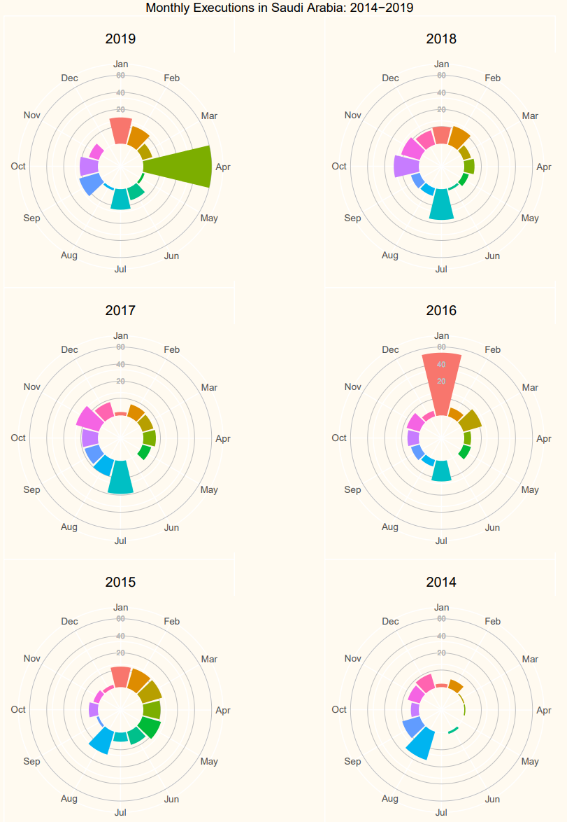
The axes here range from 0 to 60, and we see distinct execution spikes at certain intervals. The Saudi government executed nearly 60 people in both January 2016 and April 2019, and nearly 20 in each of August 2014, July 2017, and July 2018.
The code for this viz looks like this:
library(ggplot2)
library(gridExtra)
library(grid)
library(cowplot)

[//]: # Reading in the data from .csv file. This .csv contains 700+ rows, each of which contains information on a discrete individual executed in Saudi Arabia between 2014 and 2019
KSA <- read.csv ("KSA_individuals_csv.csv", header=TRUE, sep=",")

[//]: # Converting KSA date column to date type
KSA$Date.of.execution <- as.Date (KSA$Date.of.execution, "%m/%d/%Y")

[//]: # Creating execution month and year columns
KSA$Execution.month <- format(KSA$Date.of.execution, "%m")
KSA$Execution.year <- format(KSA$Date.of.execution, "%Y")

[//]: # Converting month and year columns to numeric so the for loop below doesn't exclude months 01-09
KSA$Execution.month <- as.numeric(KSA$Execution.month)
KSA$Execution.year <- as.numeric(KSA$Execution.year)

[//]: # Creating five empty lists of 12 NULL values, to be filled by the for loop
ksa_years_list_2014 <- vector("list", 12)
ksa_years_list_2015 <- vector("list", 12)
ksa_years_list_2016 <- vector("list", 12)
ksa_years_list_2017 <- vector("list", 12)
ksa_years_list_2018 <- vector("list", 12)
ksa_years_list_2019 <- vector("list", 12)


[//]: # for loop that fills each slot of the empty lists with the length of the Execution.month column (i.e. number of executions) for each month
for (i in 1:12) {
    ksa_years_list_2014[[i]] <- length((subset(KSA,
        KSA$Execution.month == i & KSA$Execution.year == 2014))$Execution.month)

    ksa_years_list_2015[[i]] <- length((subset(KSA,
        KSA$Execution.month == i & KSA$Execution.year == 2015))$Execution.month)

    ksa_years_list_2016[[i]] <- length((subset(KSA,
        KSA$Execution.month == i & KSA$Execution.year == 2016))$Execution.month)

    ksa_years_list_2017[[i]] <- length((subset(KSA,
        KSA$Execution.month == i & KSA$Execution.year == 2017))$Execution.month)

    ksa_years_list_2018[[i]] <- length((subset(KSA,
        KSA$Execution.month == i & KSA$Execution.year == 2018))$Execution.month)

    ksa_years_list_2019[[i]] <- length((subset(KSA,
        KSA$Execution.month == i & KSA$Execution.year == 2019))$Execution.month)
}

[//]: # Turning each list into a dataframe
ksa_2014_ex <- data.frame(ksa_years_list_2014)
ksa_2015_ex <- data.frame(ksa_years_list_2015)
ksa_2016_ex <- data.frame(ksa_years_list_2016)
ksa_2017_ex <- data.frame(ksa_years_list_2017)
ksa_2018_ex <- data.frame(ksa_years_list_2018)
ksa_2019_ex <- data.frame(ksa_years_list_2019)


[//]: # Renaming the dataframe columns
colnames (ksa_2014_ex) <- c ("Jan", "Feb", "Mar", "Apr", "May", "Jun", "Jul", "Aug", "Sep", "Oct", "Nov", "Dec")
colnames (ksa_2015_ex) <- c ("Jan", "Feb", "Mar", "Apr", "May", "Jun", "Jul", "Aug", "Sep", "Oct", "Nov", "Dec")
colnames (ksa_2016_ex) <- c ("Jan", "Feb", "Mar", "Apr", "May", "Jun", "Jul", "Aug", "Sep", "Oct", "Nov", "Dec")
colnames (ksa_2017_ex) <- c ("Jan", "Feb", "Mar", "Apr", "May", "Jun", "Jul", "Aug", "Sep", "Oct", "Nov", "Dec")
colnames (ksa_2018_ex) <- c ("Jan", "Feb", "Mar", "Apr", "May", "Jun", "Jul", "Aug", "Sep", "Oct", "Nov", "Dec")
colnames (ksa_2019_ex) <- c ("Jan", "Feb", "Mar", "Apr", "May", "Jun", "Jul", "Aug", "Sep", "Oct", "Nov", "Dec")

[[//]: # Combining all the dataframe rows into one dataframe
ksa_final <- rbind(ksa_2014_ex, ksa_2015_ex, ksa_2016_ex, ksa_2017_ex, ksa_2018_ex, ksa_2019_ex)

[//]: # Renaming the new dataframe rows
rownames (ksa_final) <- c(2014, 2015, 2016, 2017, 2018, 2019)

[//]: # Transposing polar_ksa
polar_ksa <- t(ksa_final)

[//]: # creating the polar_ksa_df dataframe
polar_ksa_df <- data.frame(polar_ksa)


[//]: # Renaming the columns Y2019, Y2018, etc. because this doesn't work if the names of the columns are a number
polar_ksa_df <- setNames(cbind(rownames(polar_ksa_df), polar_ksa_df, row.names = NULL),
         c("Month", "Y2014", "Y2015", "Y2016", "Y2017", "Y2018", "Y2019"))

[//]: # Converting Month column to factor so you can reorder it the proper order for display in the chart
polar_ksa_df$Month <- factor(polar_ksa_df$Month, levels=c("Jan", "Feb", "Mar", "Apr", "May", "Jun", "Jul", "Aug", "Sep", "Oct", "Nov", "Dec"))

[//]: # Making the chart matrix
plot_2019 <- ggplot(polar_ksa_df) +
coord_polar(start=-.26, clip = "off") +
ylim (-20, 60) +
ggtitle("2019")+
theme(axis.title = element_blank(),
     axis.ticks.y = element_blank(),
     axis.text.y.left = element_blank(),
      panel.background = element_rect(fill="floralwhite"),
      plot.margin=grid::unit(c(6,0,0,0), "mm"),
      plot.title = element_text(hjust = 0.5), #centering the title
      plot.background = element_rect(fill = "floralwhite")) +
geom_hline(yintercept = seq(15, 60, by = 15), colour = "gray", size = 0.2) +
geom_col(aes(Month, Y2019, fill = Month), show.legend=FALSE)+
geom_text(x = 1, y = 60, label = "60", col="gray", size=2.5)+
geom_text(x = 1, y = 45, label = "40", col="gray", size=2.5)+
geom_text(x = 1, y = 30, label = "20", col="gray", size=2.5)

#+
#geom_vline(xintercept = seq(0, 12, by = 1), colour = "gray", size = 0.2)

plot_2018 <- ggplot(polar_ksa_df) +
coord_polar(start=-.26, clip = "off") +
ylim (-20, 60) +
ggtitle("2018")+
theme(axis.title = element_blank(),
     axis.ticks.y = element_blank(),
     axis.text.y.left = element_blank(),
      panel.background = element_rect(fill="floralwhite"),
      plot.margin=grid::unit(c(6,0,0,0), "mm"),
      plot.title = element_text(hjust = 0.5), #centering the title
      plot.background = element_rect(fill = "floralwhite")) +
geom_hline(yintercept = seq(15, 60, by = 15), colour = "gray", size = 0.2) +
geom_col(aes(Month, Y2018, fill = Month), show.legend=FALSE)+
geom_text(x = 1, y = 60, label = "60", col="gray", size=2.5)+
geom_text(x = 1, y = 45, label = "40", col="gray", size=2.5)+
geom_text(x = 1, y = 30, label = "20", col="gray", size=2.5)


plot_2017 <- ggplot(polar_ksa_df) +
coord_polar(start=-.26, clip = "off") +
ylim (-20, 60) +
ggtitle("2017")+
theme(axis.title = element_blank(),
     axis.ticks.y = element_blank(),
     axis.text.y.left = element_blank(),
      panel.background = element_rect(fill="floralwhite"),
      plot.margin=grid::unit(c(6,0,0,0), "mm"),
      plot.title = element_text(hjust = 0.5), #centering the title
      plot.background = element_rect(fill = "floralwhite")) +
geom_hline(yintercept = seq(15, 60, by = 15), colour = "gray", size = 0.2) +
geom_col(aes(Month, Y2017, fill = Month), show.legend=FALSE)+
geom_text(x = 1, y = 60, label = "60", col="gray", size=2.5)+
geom_text(x = 1, y = 45, label = "40", col="gray", size=2.5)+
geom_text(x = 1, y = 30, label = "20", col="gray", size=2.5)


plot_2016 <- ggplot(polar_ksa_df) +
coord_polar(start=-.26, clip = "off") +
ylim (-20, 60) +
ggtitle("2016")+
theme(axis.title = element_blank(),
     axis.ticks.y = element_blank(),
     axis.text.y.left = element_blank(),
      panel.background = element_rect(fill="floralwhite"),
      plot.margin=grid::unit(c(6,0,0,0), "mm"),
      plot.title = element_text(hjust = 0.5), #centering the title
      plot.background = element_rect(fill = "floralwhite")) +
geom_hline(yintercept = seq(15, 60, by = 15), colour = "gray", size = 0.2) +
geom_col(aes(Month, Y2016, fill = Month), show.legend=FALSE)+
geom_text(x = 1, y = 60, label = "60", col="gray", size=2.5)+
geom_text(x = 1, y = 45, label = "40", col="gray", size=2.5)+
geom_text(x = 1, y = 30, label = "20", col="gray", size=2.5)


plot_2015 <- ggplot(polar_ksa_df) +
coord_polar(start=-.26, clip = "off") +
ylim (-20, 60) +
ggtitle("2015")+
theme(axis.title = element_blank(),
     axis.ticks.y = element_blank(),
     axis.text.y.left = element_blank(),
      panel.background = element_rect(fill="floralwhite"),
      plot.margin=grid::unit(c(6,0,0,0), "mm"),
      plot.title = element_text(hjust = 0.5), #centering the title
      plot.background = element_rect(fill = "floralwhite")) +
geom_hline(yintercept = seq(15, 60, by = 15), colour = "gray", size = 0.2) +
geom_col(aes(Month, Y2015, fill = Month), show.legend=FALSE)+
geom_text(x = 1, y = 60, label = "60", col="gray", size=2.5)+
geom_text(x = 1, y = 45, label = "40", col="gray", size=2.5)+
geom_text(x = 1, y = 30, label = "20", col="gray", size=2.5)

plot_2014 <- ggplot(polar_ksa_df) +
coord_polar(start=-.26, clip = "off") +
ylim (-20, 60) +
ggtitle("2014")+
theme(axis.title = element_blank(),
     axis.ticks.y = element_blank(),
     axis.text.y.left = element_blank(),
      panel.background = element_rect(fill="floralwhite"),
      plot.margin=grid::unit(c(6,0,0,0), "mm"),
      plot.title = element_text(hjust = 0.5), #centering the title
      plot.background = element_rect(fill = "floralwhite")) +
geom_hline(yintercept = seq(15, 60, by = 15), colour = "gray", size = 0.2) +
geom_col(aes(Month, Y2014, fill = Month), show.legend=FALSE)+
geom_text(x = 1, y = 60, label = "60", col="gray", size=2.5)+
geom_text(x = 1, y = 45, label = "40", col="gray", size=2.5)+
geom_text(x = 1, y = 30, label = "20", col="gray", size=2.5)


[//]: # Arranging the grid
require(gridExtra) #gridExtra is the ggplot alternative to par()
g <- grid.arrange(plot_2019, plot_2018, plot_2017, plot_2016, plot_2015, plot_2014, ncol=2,
             top=textGrob("Monthly Executions in Saudi Arabia: 2014-2019")
            )

g2 <- cowplot::ggdraw(g) +
  theme(plot.background = element_rect(fill="floralwhite", color = NA))

plot(g2)